Story
Story Vol.8
Mokei-teki Monozukuri CARVED【vol.3】
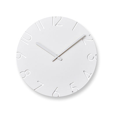
A wall always exists in the background of a wall clock. I designed the CARVED clocks with the aim of selecting a material that achieves a balance between the clock and the “texture and density” of the wall in the background, and using a processing method suitable for that material to realize my design. Now, this is a story about their manufacturing process.
Mac People magazine’s June 2013 issue
Article, Mokei-teki Monozukuri #4-3
Design & Text: Naoki Terada
Dial machining and surface painting involved great attention to detail
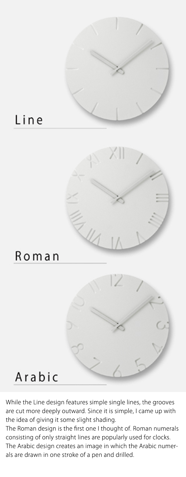
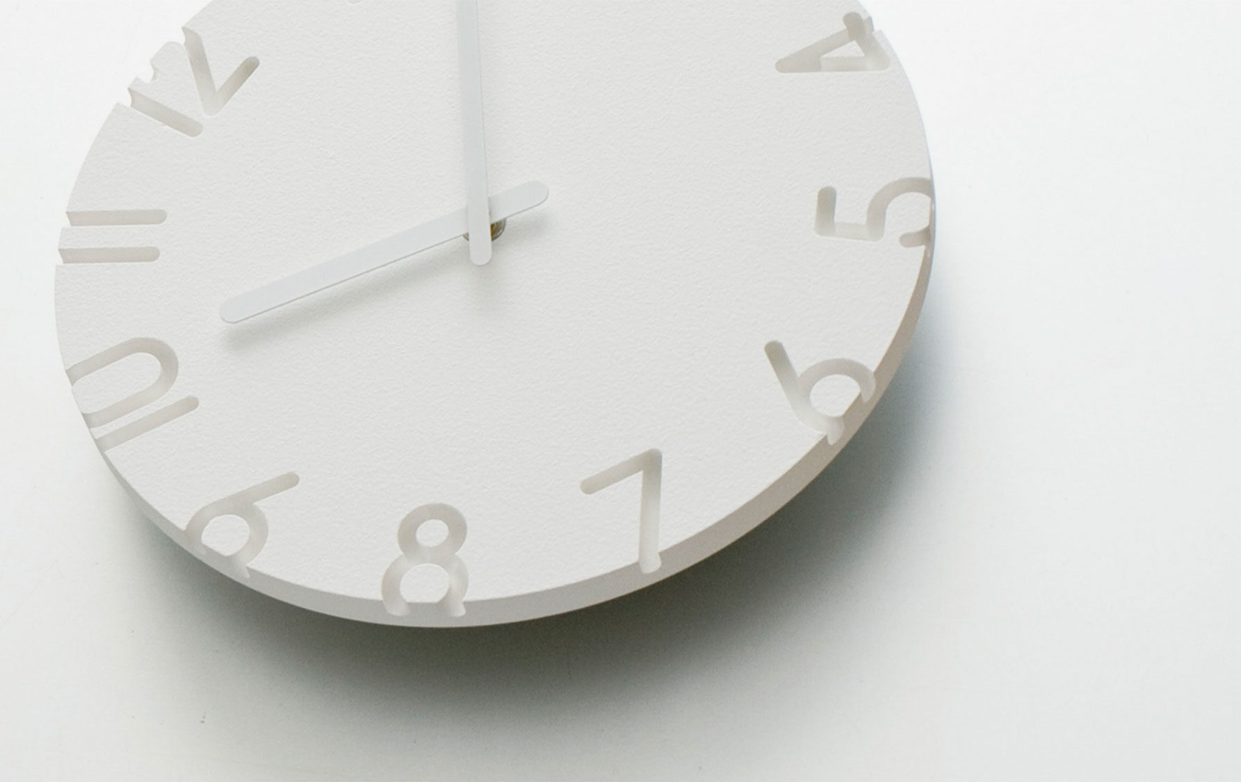
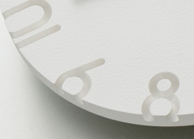
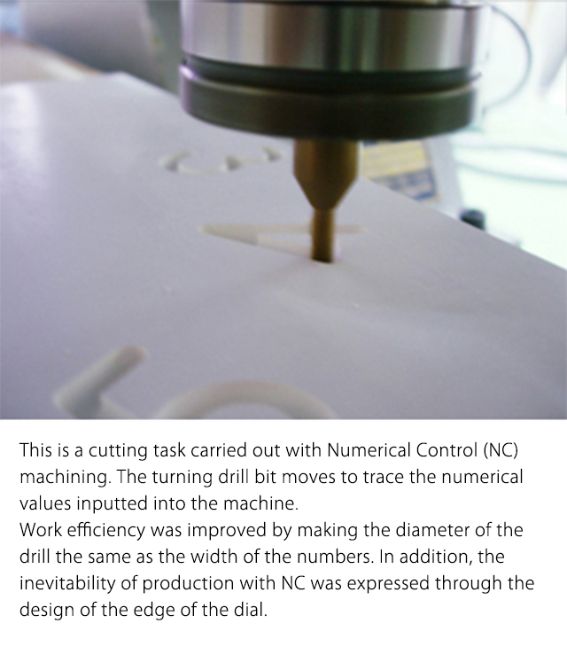
On this occasion, I made the CARVED clocks out of inorganic artificial wood, which is generally used as an interior decoration material.The dial is machined with a computer-controlled drill bit. Thus, I designed it by developing a typeface that is easy to cut with a drill bit.I came up with the idea of making the numbers go over the edge of the dial deliberately to show that it involves a machining process using a drill bit. The cross-sections were made visible from the edge of the dial so that they could be recognized visually.
I then used Adobe Illustrator to convert this idea into data and submitted it to the factory where the clocks are produced. We built several prototypes while adjusting the size of the numbers and the engraving depth.
Once we are satisfied with the shape, we start considering the surface finish.
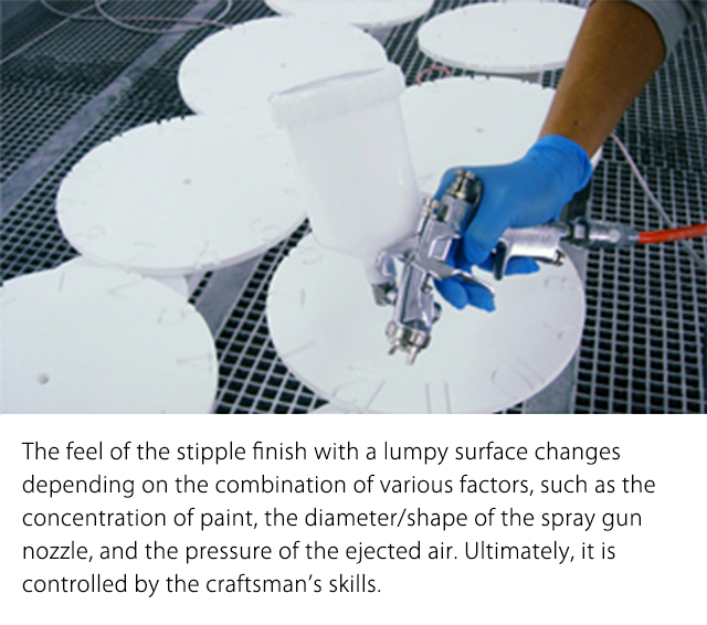
Generally, inorganic artificial wood is finished in paint rather than being left untouched, so deciding which kind of paint to use was one of the issues to be addressed once this material was selected.I tested several paint spray gun nozzles in different sizes and shapes so as not to damage the shape of the dial: a shiny gloss finish, a non-gloss finish, and a stipple finish with a lumpy surface.As a result of these tests, I concluded that a gloss finish was unsuitable for mass production as it does not work well if it contains dust or other substances.
It was interesting to work on the stipple finish. The lumps on the surface created fine shadows, which appeared to increase the density of the material. It looked better as I made the surface coarser with bigger lumps.
I felt that they were just like paint blisters that occur when a wall is painted with a roller.
Accordingly, I chose the final painting specifications in pursuit of the goal of making the paint texture of the dial as close as possible to such paint blisters.
In design jobs, it is necessary to have knowledge of what you know will happen without trying. I think the same goes for any job.Yet, it is also important to have the flexibility to first try what you know will happen and find clues for new discoveries. Although the feel of a paint finish may be a trivial matter, I am satisfied with the enhanced quality of my work after paying particular attention to it.

Naoki Terada
Architect, designer
In 1994, he completed MA course of the Association School of Architecture (AA school) in London. After returning to Japan, he produced and directed various brands as well as designing architectures and products. In 2003, he established TERADA DESIGN ARCHITECTS OFFICE. In 2011, he opened “TERADAMOKEI” in Simokitazawa, Tokyo. Currently, he’s President, COO of Interoffice Inc., an outside lecturer of Musashino Art University, and the juror of the Good Design Award.
He directs the brand, “15.0% ice cream spoon”which is produced and marketed by TAKATA Lemnos Inc., while designing all the products.
https://www.teradadesign.com/
https://www.teradamokei.jp/en
