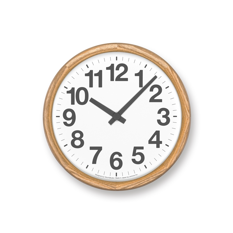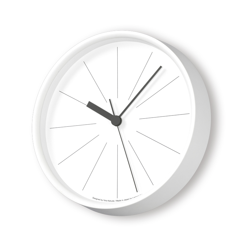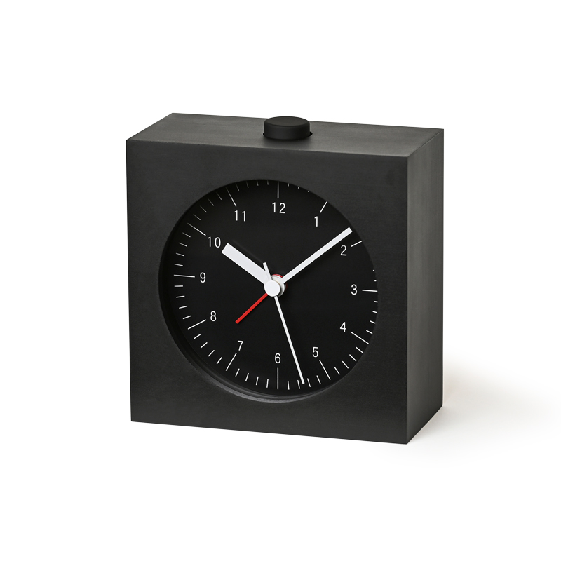
Clocks that view “visibility” as performance and have pursued it faithfully.
[ Clocks design : Yota Kakuda ]

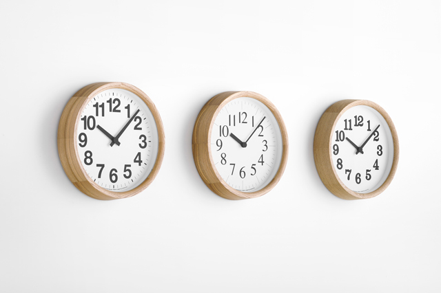 There is a form for clocks that is efficient, honest and easy to tell the time with, a shape that everyone can imagine. But it is not easy to design such a clock. Even with clocks, which are considered to be rather simple things, there are so many elements condensed into them that it makes your head spin. A clock that is “easy to read” is first achieved when these elements are configured meticulously, accurately and in three-dimensions.
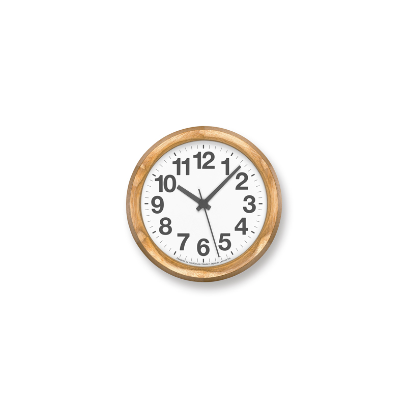
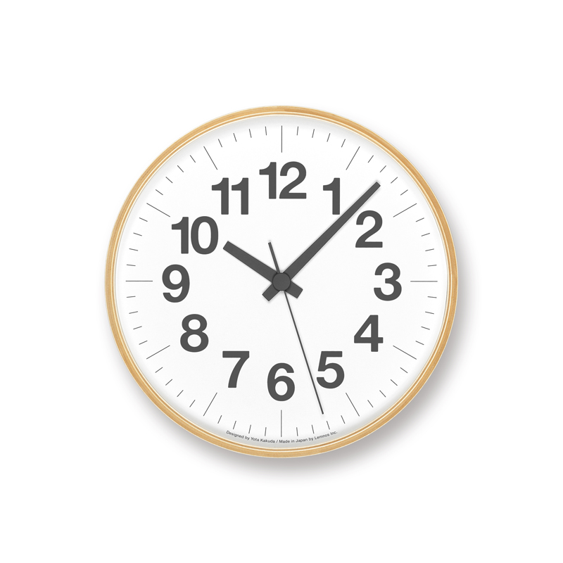
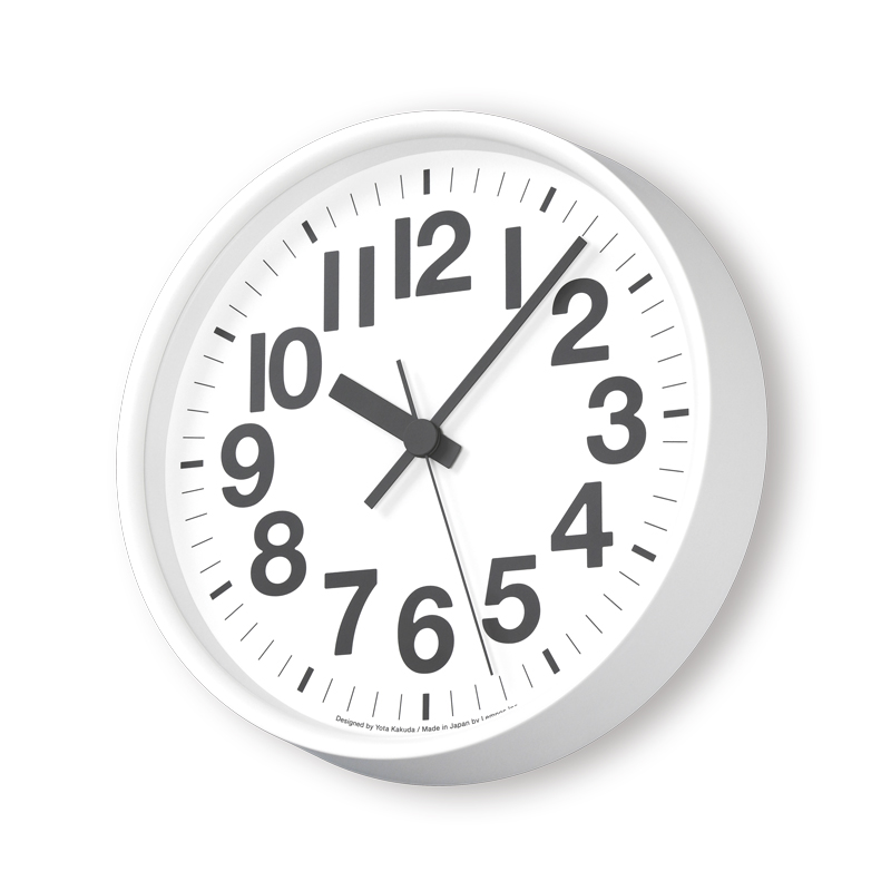
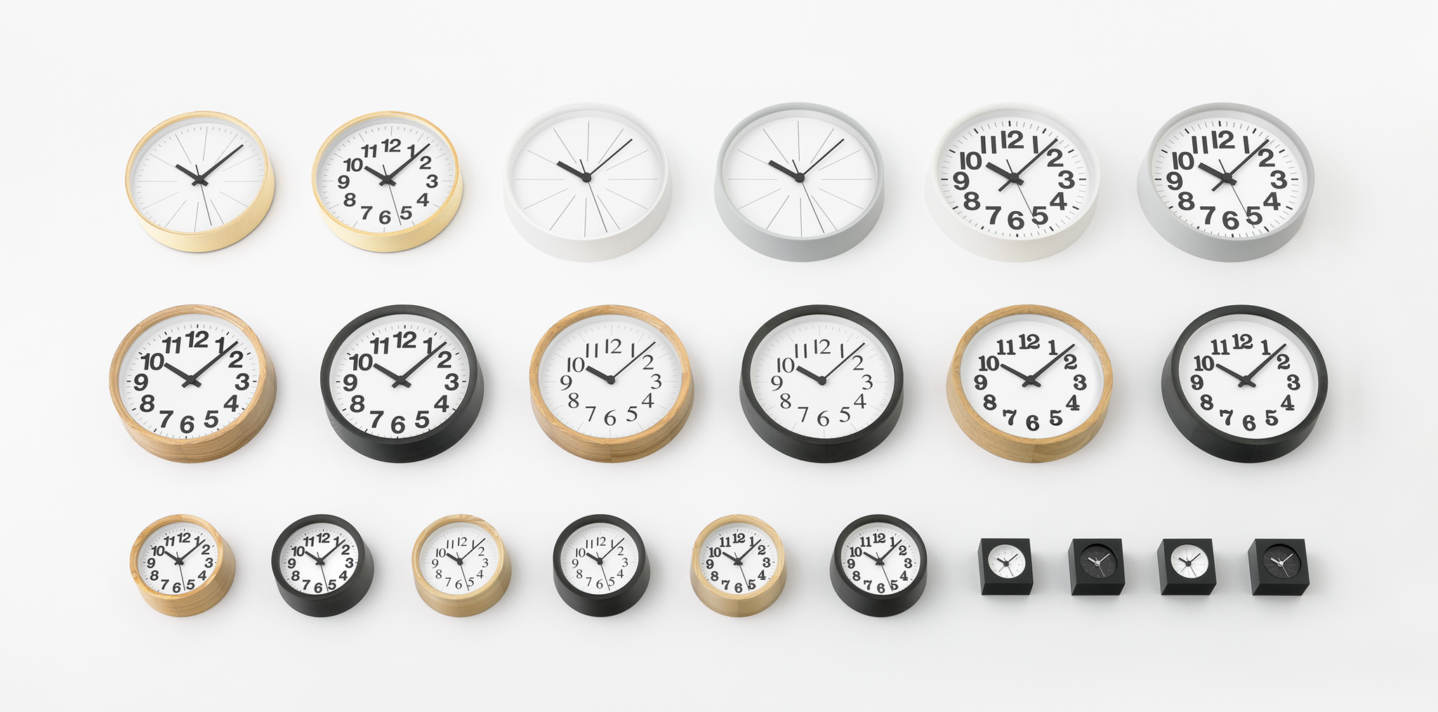
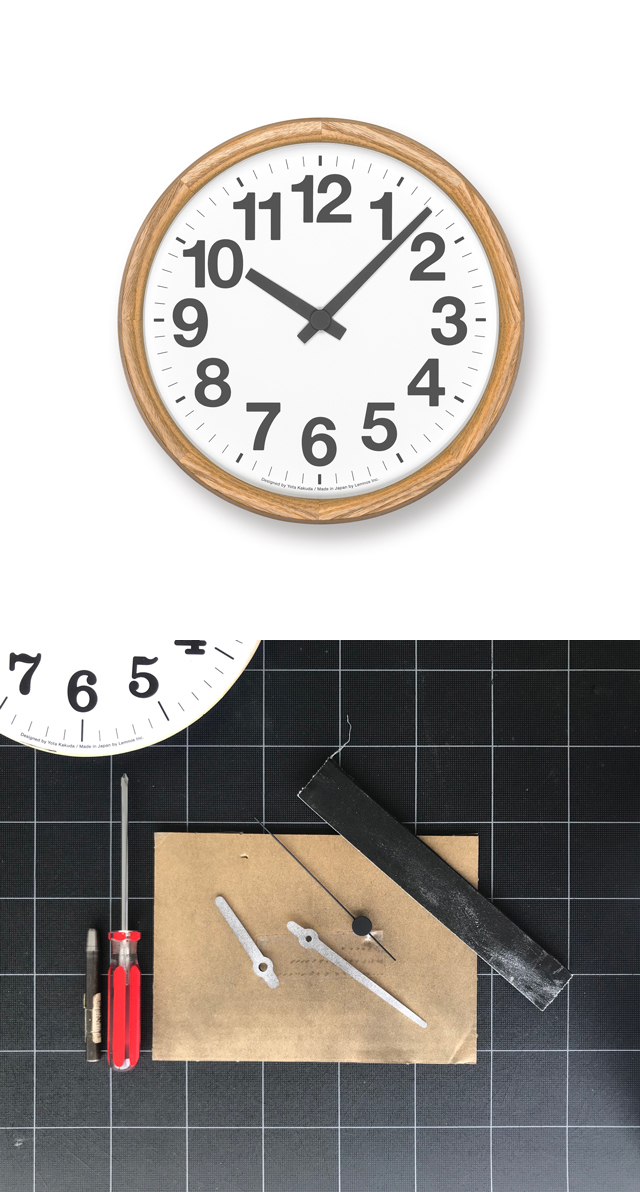 The series of clocks created by designer Yota Kakuda pursues such a form. Most of his clocks have a round wooden frame inside which twelve numbers are arranged, along with an hour hand, a minute hand and a second hand – a format that has been passed down through the years. He notes that in the process of designing these clocks, he came up against difficulties the kind of which he had never experienced before.
For example, looking at the layout of the clock face, compared to the numbers 1,2,3, on the right hand side, the numbers 10, 11 and 12 on the left hand side require more space since they have two numbers, and as such, the balance is apt to be upset. This problem can be solved by making the size of the numbers smaller overall, but when you move away from the clock, it becomes harder to read. To arrange twelve large numbers on a toric surface in such a way that they do not give off an unnatural aura requires a considerable amount of skill and ingenuity. When you look at this clock, you will probably notice that each number slightly
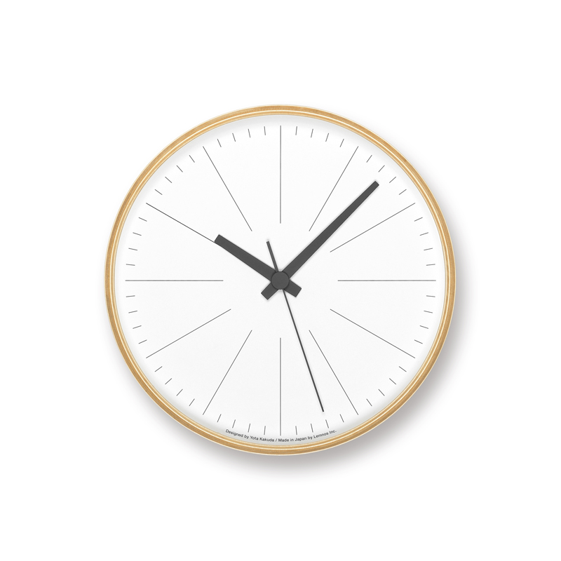
deviates from its geometrical positioning. The overall size, the typeface used for the numbers, the shape and length of the three hands, the variation in length and thickness of the indices indicating minutes – there are an infinite number of elements apart from these things that the designer needs to fine-tune. Yota Kakuda repeatedly analyzed things down to the 0.1mm level, and his daily verifying of the feel of the clocks when hung on a wall and their balance over a number of months led to the completion of this clock series. This process was utilized for all clocks he designed. While it is clear that there are differences with regard to the presence or absence of numbers and the typeface used for these clocks, there are also minute differences in other details.
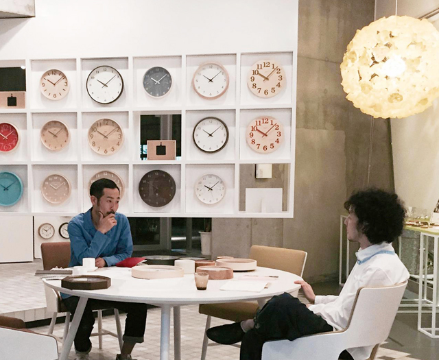 The design method for such “easy to read” clocks as these was not something that the designer carried out alone. The know-how cultivated by Lemnos up until now, along with the existence of outstanding clocks from all times and places provided fodder for the designer’s endeavor. It is said that in times when there were no computers, the technicians that designed clocks decided on specifications by using diagrams that were enlarged to more than ten times the size of the original. Because the true essence of the act of “designing clocks” was showing creativity with such faithfulness.
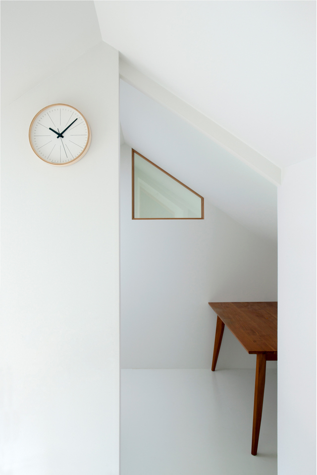 The series of clocks designed by Yota Kakuda respects the unbroken history of clocks, extracts its universal essence and crystallizes it into modern products. Their forms, which don’t stand out overly in people’s living spaces but are comfortably in people’s sight and have them experiencing time in a natural way, are suggestive of an archetype arrived at through mastering the functions and capabilities that are intrinsic to a clock.
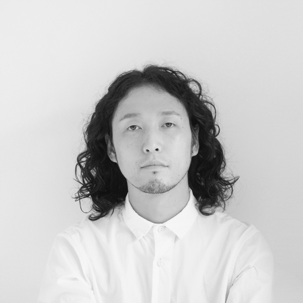
Yota Kakuda
Born in Japan in 1979, Yota Kakuda moved to London in 2003, where he gained experience in design studios including Shin and Tomoko Azumi and Ross Lovegrove, and earned his MA at the Royal College of Art, Design Products under Ron Arad and Sir Kenneth Grange, on scholarship from the Japanese government. He returned to Tokyo in 2008 and joined MUJI as a product designer. In 2011 he established YOTA KAKUDA DESIGN in Tokyo, where he works in a variety of design fields,for both international and domestic clients. He obtained major design awards including the iF DESIGN AWARD and GOOD DESIGN AWARD, and was selected as one of the finalists for the HUBLOT DESIGN PRIZE 2016, becoming the first ever nominee from Asia.
https://www.yotakakuda.com/

