fun pun clock with color !
design : Yoko Dobashi
An analog clock that aids in time management through the effects of color
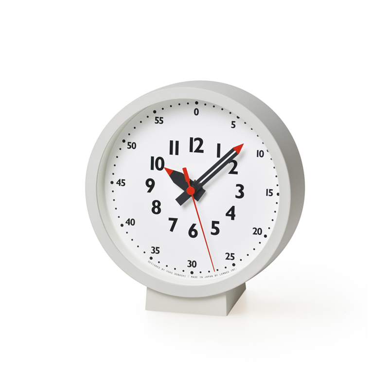
The origin of the clock’s slightly humorous name is the Japanese pronunciation when reading the minutes in the base 60 numeral system. In Japanese, you read 5 minutes as “go(five)-fun,” 10 minutes as “ju(ten)-pun,” 15 minutes as “jugo(fifteen)-fun,” and 20 minutes as “niju(twenty)-pun.” This clock is easy to explain to children, simple, made of beautiful materials, and it matches any interior design.
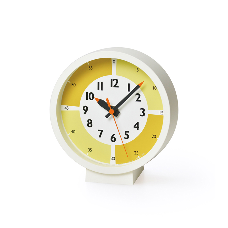
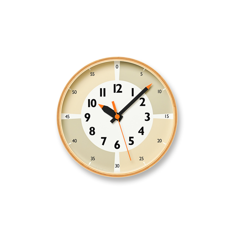
Drawing inspiration from the concept of an “Analog clock that aids in time management through the effects of color,” this specially designed clock aims to help children manage their schedules more effectively. By leveraging the characteristics of an analog clock’s “pie chart” design, clever use of colors, and the subtle division of each hour into four quarters, the clock is a valuable tool to help youngsters organize their time.
One quarter = 15 minutes is a section of time, so the end of each segment (“0” “15” “30” “45”) has thick white lines. It symbolizes the beginning, like a white canvas to start over again. The combinations of three colors were carefully chosen from thousands of color samples by mixing 12 kinds of pigment with the help of an interior paint maker from COLOR WORKS Inc.
![]()
beige:Tavern Taupe (8673M) × Sienna Sand (8223M)
lilac:Purple Rain (7974M) × Pretty Purple (7973M)
gray:Frosted Denim (8543M) × Light Showers (8532W)
* From COLORWORKS’ original paint brand “Hip”
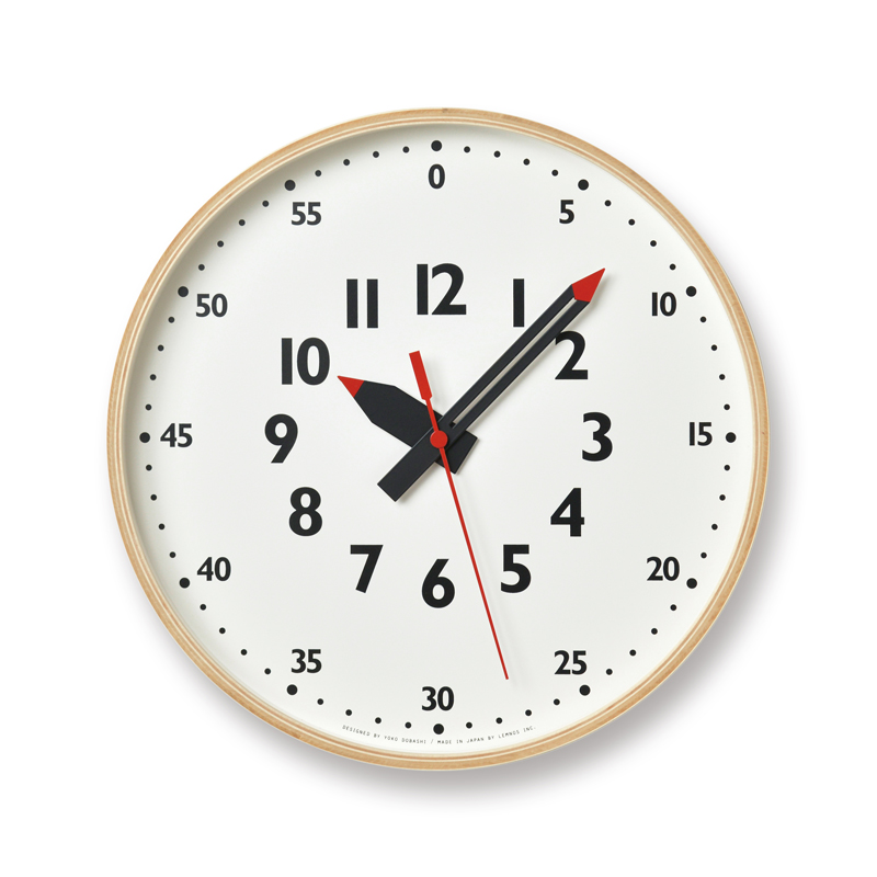
The development process incorporated the perspective of a mother, Yoko Dobashi, a designer with experience raising children, and the knowledge of an education specialist. It is a simple wall clock with a wooden frame made of more environmentally friendly natural materials.
KIDS DESIGN AWARD 2019(Japan)

YD23-09 LI
lilac
YD23-09 BG
beige

YD23-09 GY
gray
YD23-09
- Size
- φ203 × d48mm
- Weight
- 425g
- Material
- Plywood, Glass
- Specification
- Sweep Second
- Designer’s message -
[ Favorite Color Effects ]
The clocks feature beautiful subdued colors, making them a perfect fit for both children’s rooms and their own spaces. Each color has been given a unique name, making it easy to discover your personal favorites. A clock with a plywood frame made of more eco-friendly natural materials will guide the direction of your interior design as a “functional graphic.”
[ We aim to understand parents’ child-rearing concerns that change with the times ]
For the color selection, we created a prototype in cooperation with Colorworks, an interior paint company, and used the questionnaire function on social networking sites to consider everyone’s opinions. The choice of lilac in addition to the neutral colors also emerged from these interactions. When we created the prototype in response to long-standing requests for lavender, we embraced an inclusive perspective, “We want the color to have a bluish tint that can be chosen regardless of gender.”
We would like to continue to develop this watch into a long-loved product as a watch that supports all childre
Yoko Dobashi


Yoko Dobashi
Yoko Dobashi spent five years working at Idee co. Ltd. (1997-2002). She was involved in the development of standard furniture and in the launch of the “SPUTNIK” brand, which was introduced in London, Milan, and New York. Since 2012 she has hosted the “Design life with kids interior workshop.” She is active independently as a freelance designer and interior writer, working in collaboration with various companies and media. In 2017 she provided design to TAKATA Lemnos and the “fun pun clock” won the GOOD DESIGN AWARD. Her article “Interior for a 156-cm-tall” is serialized at Precious.jp.
http://yokodobashi.com/